Expertise
UX Design
Usability Research
UI Design
Platforms
iOS (Swift)
Web
Key Deliverables
Visual design (Sketch)
UX Documentation


About project
App for tutors and learners to connect and focus on what’s needed or wanted. While the market already got some great companies like Skillshare, Coursera and other fully automated learning management systems, there’s problem and that’s a fact.
They all lack humanity: in terms of teacher-to-student educational processes, you have to deal with with your problems on your own, ending up spending 10 hours to find a solution your teacher would answer and explain in couple of minutes.
Ability to actually interact with a teacher, right from mobile (or web): that’s the future, that is now. Quicktutor features the widest variety of industries, where you can learn something new. How about worlds best lasagna? I’m sure, you can learn that too, without even getting up from the coach.
That’s about quicktutor: Learn & Teach on the go.
Design thinking as primarily process, adjusted by team needs.
- Bi-weekly workshops, where we reviewed global milestones, performed usability testing and gathered feedback.
- Product iteration based on customer needs: actively gathering and prioritising user feedback with ticketing systems and feedback forms.
- Conducting usability research and testing new patterns with focus groups.
- Providing a smooth transition from previously used patterns that resulted inefficiently.
- Onboarding users with relevant product updates based on app usage analytics, personalised and gently.
- Launching features that perform well during closed TestFlight beta testing.
- Rethinking solutions that did not work, gathering qualitative feedback from users initially in form of pre-defined options questionnaire and then going to in-depth interview with selected portion of users.
The work process background and business challenges
Leading meetings with CEO and Development team. Outlining and prioritising usability issues that were discovered and then, hosting a meeting/workshop where we would collaborate, practicing user-oriented design approaches with the team.
Having a full freedom in communication between team members, CEO and focus groups: helped to perform in the most efficient way.
An absolutely unique experience with its own pros and cons. The most exciting was the way we were having a weekly retrospective workshops, practicing design thinking and many-many other principles and methodologies in product design and development.
During the workshops, for those cases when we defined a real issue: it required immediate actions that we occasionally would have to perform. That, on the other hand, allowed us to see how our solutions are used by the actual user and where should we focus more.
Just imagine this: it is a special day for your team, your project is about to have launched marketing campaign or is being promoted in some other way, that is about to get large volume leads.
I’m super grateful for such great UX analytic tools like Fullstory (sorry Google, but you lost this time), that allows you to see users interactions in live mode, providing you with all required info: dead clicks, rage clicks, heat maps and even let’s your set your own formulas.
- This is how I’ve managed to resolve unpredicted issues for new visitors: even before they actually experience them. It did affect
small percentage of leads, but that’s a lot better than having 100% of visitors to experience troubles with UX-patterns that they expect to be familiar with. - This is how, seeing the impact of tiny changes, like running A/B tests with exact design but different CTA colors: dramatically scales the benchmarks the business is focused on, enhancing customer satisfaction and making the world better.
At the time I’ve started working on the project with team, it was managed by Collin (CEO) and initial app designs were built in Sketch by some other designer, it was crucial time to re-organise the design environment, since the project at that time was already big and even though it had many components: it was unnecessarily complex.
Below are the initial business goals
- Audit user interface and improve UX.
- App did not follow common UI patterns, users were getting confused.
- Simplifying dashboards and payout flows.
- Defining and iterating custom, usability tests and benchmarks

Sergey’s role
As a UX/UI expert Sergey lead design process for app and web services, reporting directly to Collin, CEO & Founder of the app.
- Competitor research
- User research
- User persona
- User scenario
- Sitemaps
- Mid-fidelity wireframes
- User Interface (UI)
- Re-organisation of UI Elements in favour of building Atomic Design-system
- Prototyping
- Usability testing
– finding and fixing issues with design patterns,
– conducting custom research methods per project goals,
– UI Guidelines and transition to atomic design principles - Conversion centred design and marketing: brand visualisation

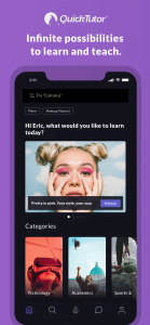
Apple Appstore Marketing designs — instead of regular screenshots, which did not provide enough of app uniqueness and value.
Initially I’ve created A, B and C versions, that are displayed below:


The most effective, outperforming conversion expectations, was the 2nd version, which is still used at Apple’s Appstore marketplace.

Key takeaways
- Using fullstory or other advanced analytic tools can help your business to overcome many issues and solve real problems.
- Having a weekly meeting where global milestones and effectiveness is discussed — greatly improves the workflow.
- Users-oriented design approaches, like the design thinking methodology helps to focus on what’s required for the project, instead of implementing features that an individual specialist can only guess.
- Brand consistency and even a tiny steps forward to building a visual identity provides great results for the long-term game.

